
One of the most common problems I saw frequently on Pinterest are the color schemes that fail to catch the eye or represent your brand.
I know it's hard to discover it within a day, so, that's why I would love to share with you how to boost your Pinterest engagement using the correct color schemes 😉
Let's start!!!
The secret of getting ahead is getting started.

Mark Twain
He was an American humorist, author, and essayist.Understanding Pin Color Schemes
Creating eye-catching Pinterest pins requires an understanding of pin color schemes.
With the right knowledge, you can choose colors that make your pins stand out.
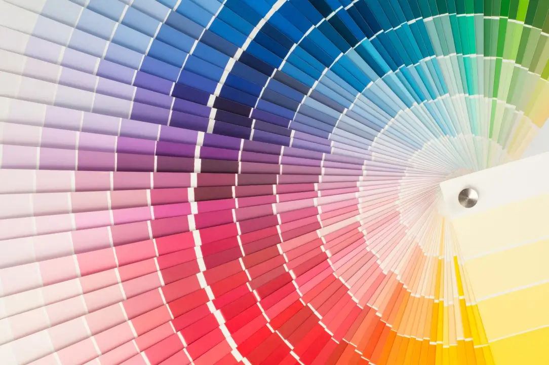
Basics of Color Theory
Color theory helps you create effective pin color schemes. It explores how colors interact and influence each other.
- Primary colors: Red, Blue, Yellow, serve as the foundation.
- Secondary colors: Green, Orange, Purple, form by mixing primary colors.
- Tertiary colors: come from blending primary and secondary colors.
Different color schemes use these colors:
- Complementary Colors: Colors opposite each other on the color wheel, like red and green, offer strong contrast.
- Analogous Colors: Adjacent colors on the wheel, like blue and green, create harmony.
- Triadic Colors: Three evenly spaced colors, such as red, yellow, and blue, provide vibrant contrast.
Importance of Choosing the Right Colors
Choosing the right colors affects pin engagement. Studies show that certain color combinations elicit emotional responses.
For example, warm colors (red, orange, yellow) often evoke excitement, while cool colors (blue, green, purple) tend to calm viewers.
Brands benefit by aligning pin colors with their identity. A consistent color palette strengthens brand recognition.
Popular brands like Coca-Cola and Tiffany & Co. effectively use signature colors to enhance visibility.
Successful Pinterest pins balance readability and visual appeal. Ensure text contrasts well with background colors.
High contrast, like white text on a dark background, improves readability.
Understanding pin color schemes and their impact helps you create pins that attract more views and engagements.
Popular Color Palettes
Discovering popular color palettes can significantly boost your Pinterest pin's effectiveness and appeal.
Monochromatic Palettes
Monochromatic palettes use varying shades, tints, and tones of a single color. These palettes provide a clean, harmonious look, making your pin visually cohesive.
For example, using different blues can create a soothing and professional feel, ideal for corporate or tech content.


Monochromatic schemes excel in minimalist designs because they simplify the color selection process without sacrificing elegance or consistency.
Analogous Palettes
Analogous palettes combine colors that are next to each other on the color wheel. This method creates a natural blend because the colors share common hues.
For example, combining yellow, yellow-green, and green produces a lively, vibrant effect.
Analogous palettes work well for themes related to nature, wellness, or creativity, where a harmonious look enhances the overall message.


Complementary Palettes
Complementary palettes use colors opposite each other on the color wheel to create high contrast.
These contrasting colors make elements stand out, drawing immediate attention to your pins.
For instance, pairing blue with orange creates a striking, dynamic look.
Complementary color schemes are perfect for call-to-action pins, sales promotions, or any content needing high visual impact to grabs users' attention instantly.
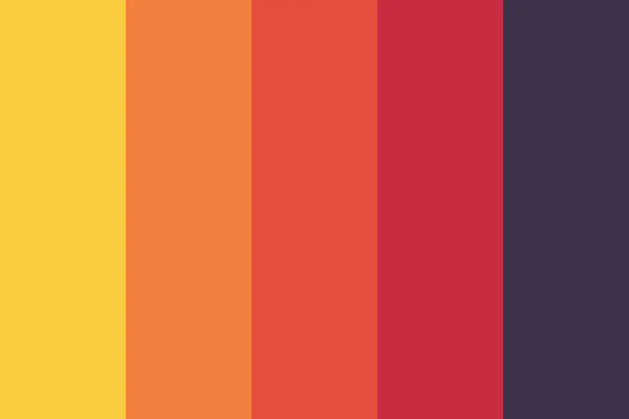
Vintage and Retro Colors
Vintage and retro colors evoke nostalgia and charm. Use muted tones like mustard yellow, dusty pink, and olive green.
These colors create a timeless appeal, adding depth and character to your pins.
Retro-inspired pins often attract users who appreciate aesthetic value and historical references.

Minimalist and Pastel Tones
Minimalist and pastel tones offer a clean, fresh look. Include soft colors like baby blue, mint green, and blush pink.
These tones enhance focus on the content, providing a soothing visual experience.
Minimalist palettes reduce visual clutter, making your pins more digestible and appealing to a broad audience.


Bold and Bright Combinations
Bold and bright combinations catch attention quickly. Utilize vibrant colors like electric blue, neon pink, and bright yellow.
These combinations create a dynamic and energetic feel, drawing viewers immediately to your pins.
Bold schemes work well for promoting exciting events, new products, or any call to action requiring immediate attention.
Design Tips for Effective Pin Color Schemes
Creating effective pin color schemes requires thoughtful consideration of balance, accessibility, and emotional impact to enhance engagement.
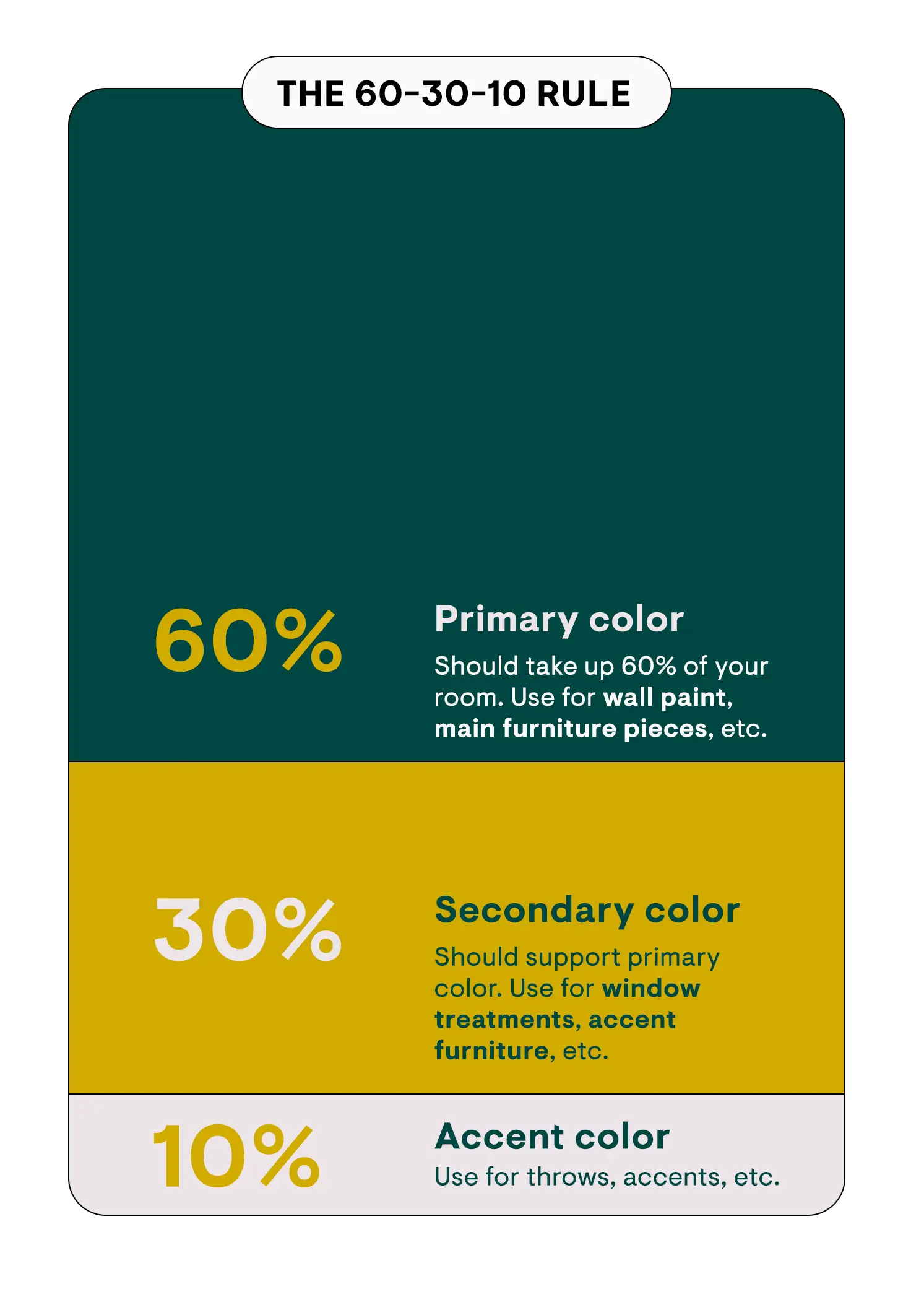
Balancing Colors Using the 60-30-10 Rule
The 60-30-10 rule offers a simple framework for creating balanced color schemes. You use 60% of a dominant color, 30% of a secondary color, and 10% of an accent color.
This composition ensures a harmonious look. For instance, in a beach-themed pin, you might use 60% blue, 30% beige, and 10% gold.
This balance helps your pins look aesthetically pleasing without overwhelming the viewer.
Ensuring Accessibility and Visibility
Ensuring accessibility in your pin designs enhances visibility across diverse audiences. High-contrast color combinations improve readability for users with visual impairments.
Tools like Coolors Contrast Checker can help you select accessible color schemes. For example, pairing dark text with a light background boosts legibility.
Visibility improvements ensure your content reaches a wider audience effectively.
Creating Emotional Impact with Colors
Colors evoke specific emotions, influencing viewer response. Red can incite urgency and excitement, while blue often creates a sense of calm and trust.
Leveraging these emotional responses aligns your pins with your marketing goals. For example, a red call-to-action button on a mostly neutral pin might encourage immediate engagement.
The strategic use of colors amplifies your content's emotional impact.
Case Studies and Examples
Examining case studies of successful pin color schemes helps you understand how top designers effectively use colors to engage viewers and enhance their content.
Successful Pin Color Schemes from Popular Designers
- Jasmine Star: Jasmine effectively uses a vibrant mix of complementary colors like blue and orange in her photography pins. This contrast grabs attention and highlights key elements.
- Lauren Hom: Lauren's pins blend analogous colors such as shades of pink and red to create a harmonious, visually appealing design. Fans find her work both vibrant and cohesive.
- Mari Smith: Mari employs a combination of high-contrast colors, including white backgrounds with bold text in black and blue. The readability and professional aesthetic in her social media tips keep users engaged.
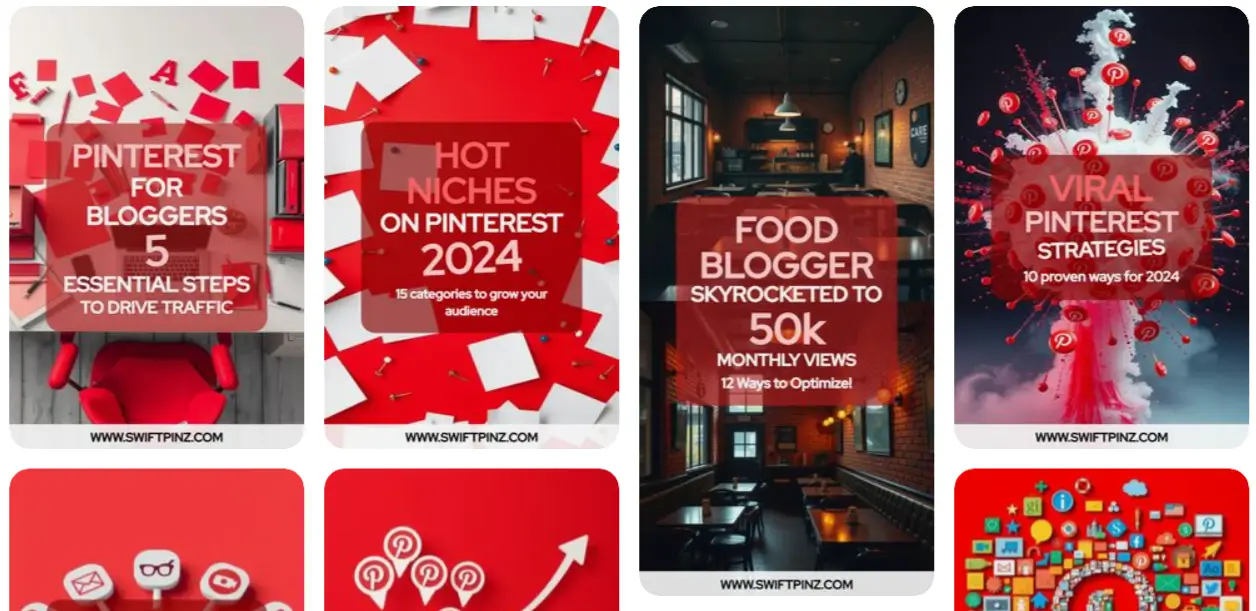
- Travel Pins: Travel bloggers like Nomadic Matt use warm colors like oranges and yellows to evoke feelings of excitement and adventure. These colors build an inviting atmosphere.
- Food Pins: Food networks, such as Tasty, often utilize bright, mouth-watering colors like reds and greens that stimulate appetite and interest. High-quality images paired with these hues boost engagement.
- Fashion Pins: Fashion influencers, like Chiara Ferragni, rely on pastel colors to maintain a soft, elegant look. The consistent use of these colors solidifies brand identity and appeals to a fashion-conscious audience.
Conclusion
Choosing the right pin color scheme can significantly impact your Pinterest success.
By understanding color theory and aligning your colors with your brand identity you'll create pins that not only catch the eye but also resonate with your audience.
Look to successful designers and influencers for inspiration and don't be afraid to experiment with different color combinations.
Keep your audience in mind and let your creativity shine through your color choices.
Frequently Asked Questions
Why is it important to use the right color scheme for Pinterest pins?
Using the right color scheme for Pinterest pins can significantly enhance user engagement and drive traffic. Colors influence emotions and can make your pins more appealing to your target audience.
What is color theory and why is it important for Pinterest pin design?
Color theory involves the study of how colors interact together and the visual effects of specific color combinations. Understanding color theory helps in creating aesthetically pleasing and effective Pinterest pins that attract more viewers.
How can I align Pinterest pin colors with my brand identity?
To align Pinterest pin colors with your brand identity, use your brand's signature colors prominently. Ensure consistency across all pins for a cohesive look, enhancing brand recognition and trust.
Which Pinterest pin color schemes have been successful for designers?
Designers like Jasmine Star, Lauren Hom, and Mari Smith have successfully used color schemes that align with their brand identities. Their pins often include high-contrast combinations and complementary colors to engage viewers.
How do travel bloggers use colors in their Pinterest pins?
Travel bloggers use warm, inviting colors and high-contrast combinations to evoke emotions like excitement and adventure. These colors can make destinations appear more appealing and exotic.
What color schemes work well for food networks on Pinterest?
Food networks often use appetizing warm colors like reds, oranges, and yellows to make food look more delicious and inviting. High contrast combinations can help highlight textures and details.
Why do fashion influencers prefer pastel hues for their Pinterest pins?
Fashion influencers often use pastel hues to create a soft, elegant, and trendy look. Pastel colors can evoke feelings of calmness and sophistication, making fashion items look more appealing.
Can the right color scheme really boost engagement on Pinterest?
Yes, the right color scheme can significantly boost engagement on Pinterest. Visually appealing pins that align with viewers' tastes and emotions are more likely to be saved, shared, and clicked.
How do I choose a color scheme for my Pinterest pins?
A popular method is the 60-30-10 rule: use a primary color 60% of the time, a secondary color 30%, and an accent color 10%. This helps in creating a balanced and harmonious color scheme.

