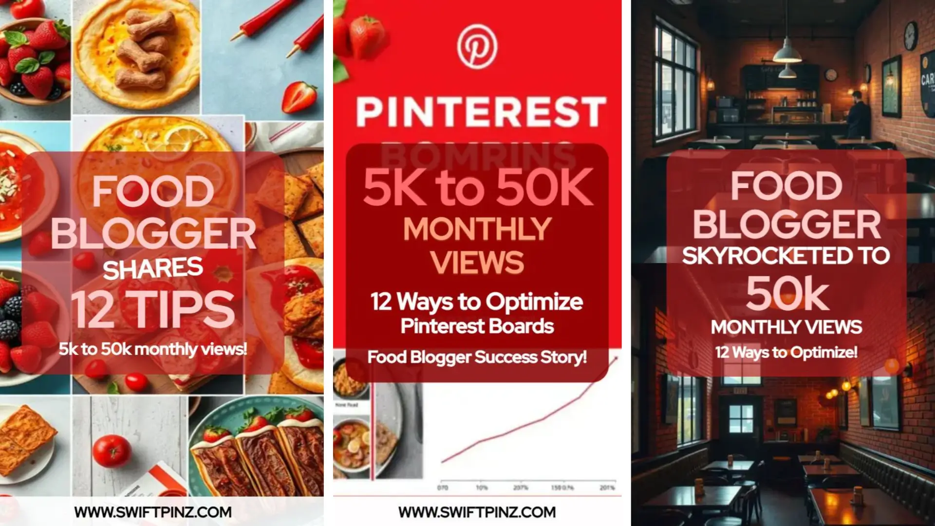
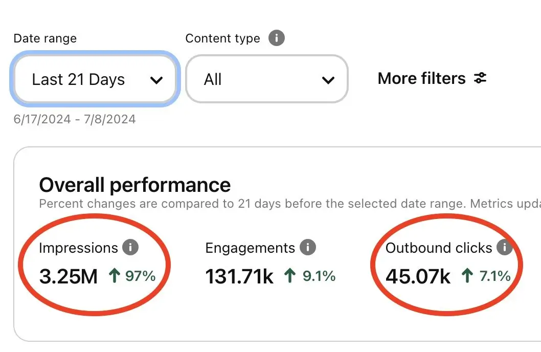
How many times you were scrolling through Pinterest and suddenly, your eyes lock onto a stunning pin. That's the power of great design!
Let's see the 10 best pin design tips that'll make users lock their eyes on your content 🎉
Design is not just what it looks like and feels like. Design is how it works.

Steve Jobs
He was an American entrepreneur, inventor, and software engineer.The Importance of the Design on Pins
Your Pinterest pin is like a digital billboard. It's your chance to make a lasting first impression. A well-designed pin can stop scrollers in their tracks and entice them to click through to your content.
Think of it as your visual elevator pitch. You have mere seconds to capture attention in a sea of content. That's where great design comes in.
Benefits of a Cool Design
Cool designs aren't just about looking pretty but strategic tools in your Pinterest marketing arsenal. A visually appealing pin can significantly boost your engagement rates.
For instance, Lucia, a food blogger, saw her click-through rate triple after revamping her pin designs. She focused on vibrant food photography and clear, appetizing text overlays. The result? More traffic to her blog and a growing following.
Cool designs also help build brand recognition. When users consistently see your well-crafted pins, they start associating quality content with your brand. This can lead to more followers, shares, and ultimately, more traffic to your site.
Tip: Remember, a cool design isn't just about aesthetics. It's about communicating your message effectively, instantly and making your content stand out and compelling users to take action.
10 Design Tips to make Your Pins Shine
Ready to transform your Pinterest game? Let's dive into the ten design tips that'll make your pins irresistible to scrollers.
1. Vertical images
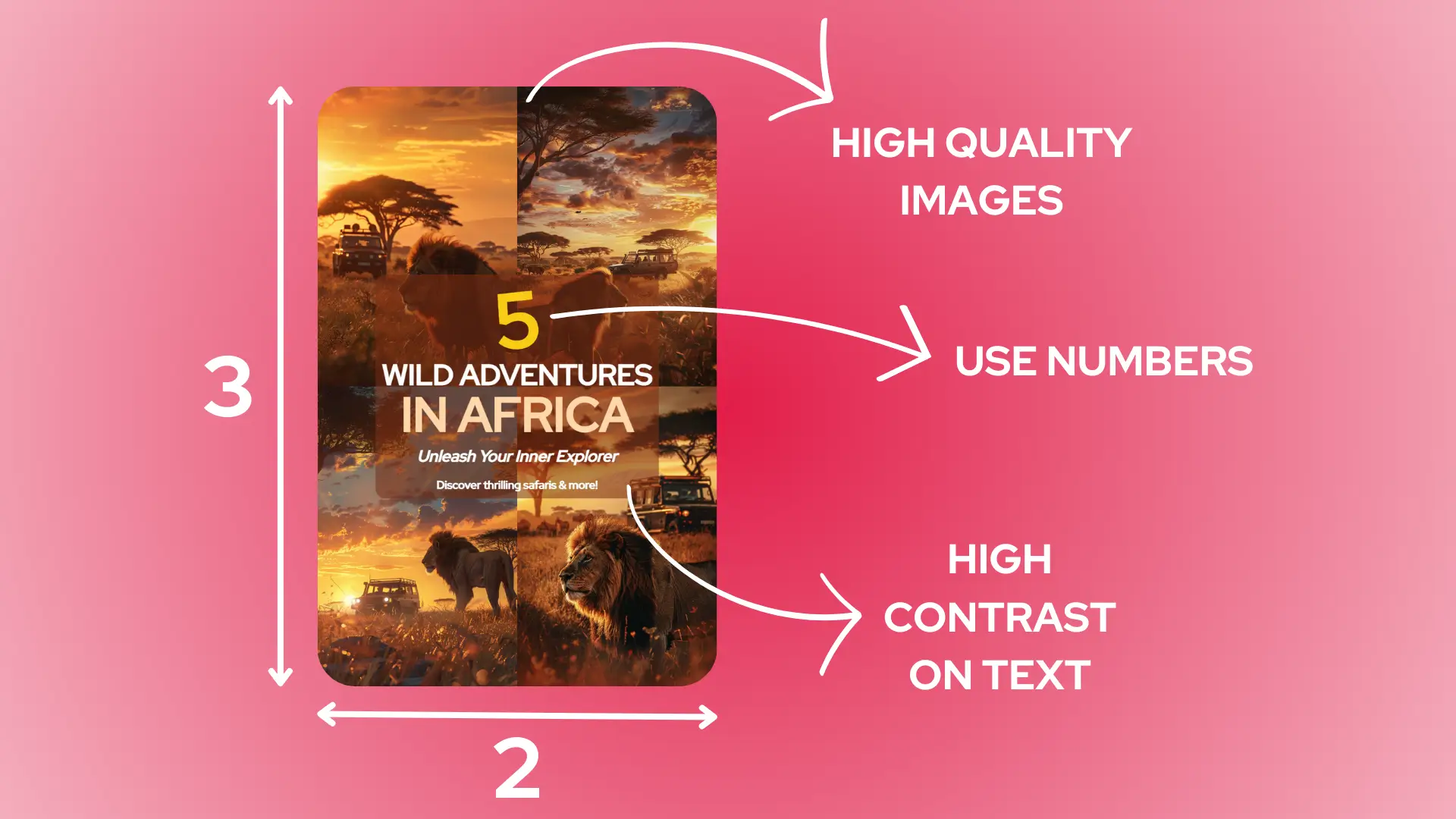
Think tall and sleek. Vertical images are the supermodels of Pinterest. They command more real estate on the feed, making them hard to miss.
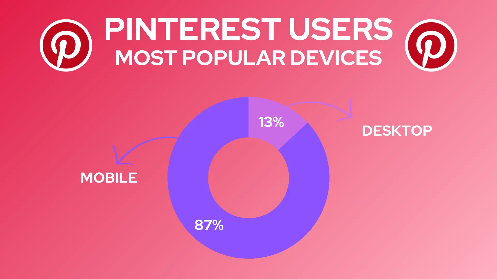
Aim for a 2:3 aspect ratio, like 1000x1500 pixels. This size ensures your pin looks great on both mobile and desktop. Remember, most Pinterest users are on their phones, so vertical is the way to go.
2. Clear, readable text overlays
Your text should be like a good friend - clear and easy to understand. Use fonts that are legible even on small screens.
Keep it brief and punchy. Think headlines, not paragraphs. For example, "5 Easy Ways to Boost Your Blog Traffic" is more effective than a long-winded explanation.
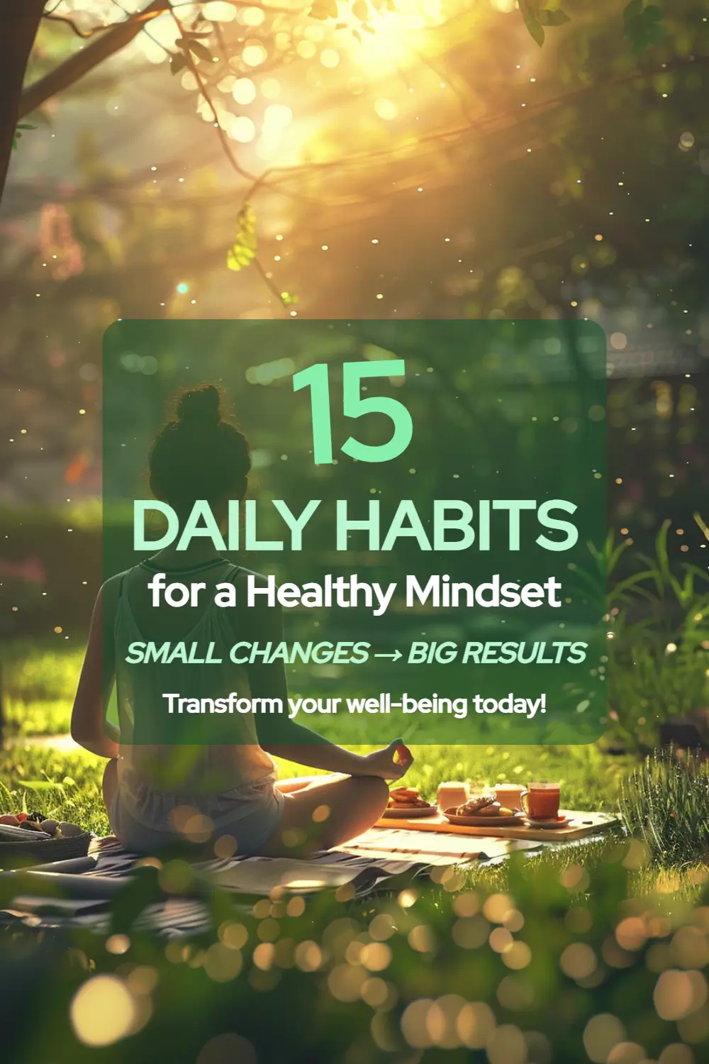
If you like these types of pins you can check out our ai pin generator to create your owns for your blog 🥳
3. Vibrant, high-quality images
Blurry, dull images are Pinterest kryptonite. Your images should pop with vibrant colors and crystal-clear quality.
Use high-resolution photos that catch the eye. Bright, contrasting colors often perform well. For instance, a food blogger might showcase a vivid green salad against a white plate for maximum impact.
4. Branding elements
Your pins should be like your business card - instantly recognizable. Incorporate your brand colors, logo, or signature style into each pin.
Keep it subtle though. A small logo in the corner or consistent color scheme is enough. You want people to recognize your brand without feeling like they're looking at an ad.
5. Effective use of white space
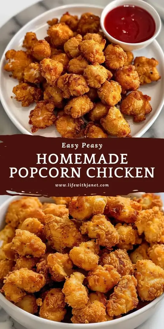
Don't crowd your pins. White space is your friend. It gives your design room to breathe and helps important elements stand out.
Think of it like serving a gourmet dish. You wouldn't pile everything onto a tiny plate, right? Give your content some elbow room. This makes your pin easier to understand at a glance.
6. Infographic-style content
People love bite-sized information. Infographic-style pins are perfect for delivering quick tips or step-by-step guides.
Break down complex ideas into simple visuals. For example, if you're sharing a recipe, show the ingredients and steps with icons and brief text. This makes your content more shareable and saves users from clicking through for basic info.
7. Consistent visual style
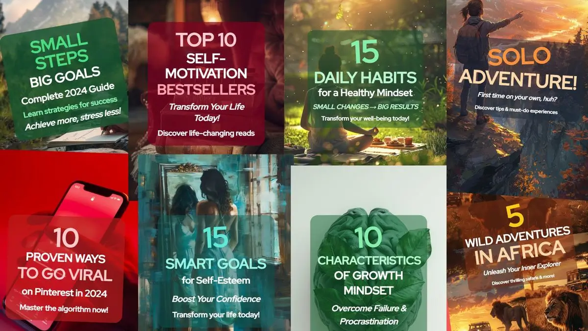
Develop a signature look for your pins. This doesn't mean they should all look identical, but they should feel like part of the same family.
Use similar color schemes, fonts, or layouts across your pins. This consistency helps users recognize your content instantly as they scroll through their feed.
8. Mobile-optimized designs
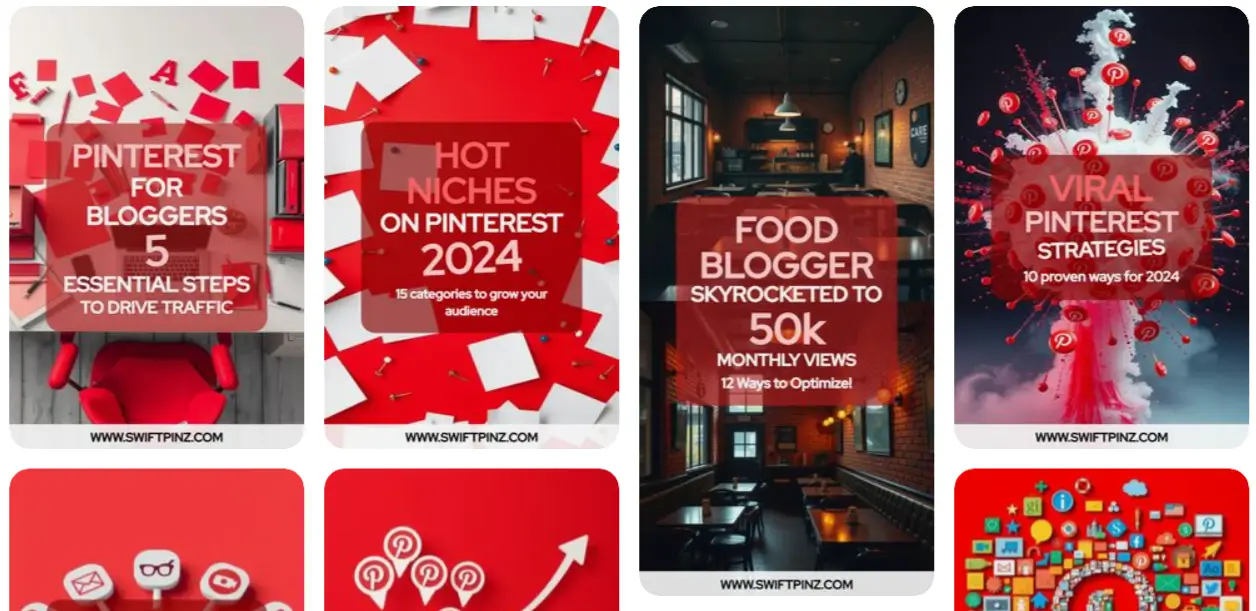
Most Pinterest browsing happens on phones. Make sure your designs look great on small screens.
Keep text large enough to read on mobile. Avoid intricate details that might get lost on a tiny display. Test your pins on your own phone to ensure they're mobile-friendly.
9. Rich pins
Leverage Pinterest's Rich Pins feature. These automatically sync information from your website to your pins, adding extra details directly on Pinterest.
There are four types: article, product, recipe, and app pins. They provide more context right on the pin, which can increase engagement and click-throughs.
10. A/B testing of designs
Don't just guess what works - test it! Create multiple versions of your pins and see which performs best.
Try different images, text overlays, or color schemes. Pinterest's analytics can help you track which designs get the most engagement. Use these insights to continually refine your pin strategy.
3 Pin Design Examples
Let's put theory into practice. We've handpicked three stellar pin designs that nail the tips we've discussed.
These examples will inspire you and show you how to apply these principles effectively.
Blog Pin
Let's see this pin to understand how to promote blog content effectively on Pinterest.
Here's why it works:
- Eye-catching imagery: The background shows a person using Pinterest, immediately contextualizing the content.
- Bold text overlay: "BOOST YOUR PINTEREST VIEWS" stands out clearly, using contrasting colors and large font.
- Value proposition: "12 Optimization Techniques" tells users exactly what they'll gain from clicking.
- Branding: The website URL at the bottom ensures users know where to find more content.
- Color scheme: The red background ties in with Pinterest's brand color, while the translucent text box ensures readability.
- Vertical format: The pin uses the ideal vertical layout for maximum visibility in the Pinterest feed.
This pin effectively combines visual appeal with clear information, enticing users to click through and learn more about boosting their Pinterest performance.
This eye-catching pin was generated using Swiftpinz. Want to create stunning pins like this? Try Swiftpinz now and watch your Pinterest engagement soar!
Product Pin
Here's a product pin that showcases a new sneakers. It's a great example of how to use rich pins to provide more context and value to your content.
Here's why it's effective:
- High-quality image: The photo is clear, well-lit, and shows the product from multiple angles.
- Minimal background: The simple white background keeps the focus on the shoes.
- Detail showcase: The image highlights the texture and color of the shoes clearly.
- Lifestyle implication: The casual positioning of the shoes suggests everyday wear, appealing to potential buyers.
- No text overlay: Sometimes, a striking image speaks for itself. Here, the product is the star.
- Neutral color palette: The earthy tones are visually appealing and on-trend.
- Brand recognition: The distinctive Nike swoosh is clearly visible, catering to brand-conscious consumers.
This pin effectively presents the product in a way that's visually appealing and informative, likely to attract potential buyers scrolling through Pinterest.
Service Pin
Finally, let's see a service pin that showcases a web design service.
- Eye-catching visuals: The colorful, abstract 3D head immediately grabs attention.
- Clear service offering: "Web3 Design Agency" is prominently displayed at the top.
- Service breakdown: The pin includes a section on "Our Services," highlighting UI/UX Design.
- Visual representation of service: The UI/UX Design section includes relevant icons and graphics.
- Social proof: The pin displays impressive statistics like "240+ partners" and "92% faster technology."
- Call-to-action: "GET STARTED" button encourages user engagement.
- Additional services: A list of other services is visible, giving a complete picture of the agency's capabilities.
- Credibility indicators: The bottom shows customer numbers, coverage, and other metrics to build trust.
This pin effectively combines striking visuals with clear information about the service offered. It provides enough detail to intrigue potential clients while maintaining an aesthetically pleasing design.
Conclusion
You've now got the insider knowledge to create Pinterest pins that truly shine. Remember, great pin design is a blend of art and strategy. It's about catching the eye and conveying value in a split second.
Don't be afraid to experiment with these tips. What works for one audience might not work for another. The key is to keep testing, analyzing, and refining your approach.
What's next?
Now that you're armed with these design tips, it's time to put them into action. Start by revamping some of your existing pins. See how a fresh design impacts their performance.
Next, plan out a series of new pins incorporating these principles. Remember to maintain consistency with your brand while trying out different visual styles.
Consider using tools like Swiftpinz to streamline your pin creation process.
It can help you quickly implement these design best practices and create stunning pins that drive engagement.
Frequently Asked Questions
How do you make pins look good?
Use high-quality images, clear text overlays, and a cohesive color scheme. Keep your design clean and uncluttered. Stick to vertical formats and make sure your branding is consistent.
How to create a perfect pin?
There's no one-size-fits-all perfect pin, but focus on eye-catching visuals, clear value proposition, and easy-to-read text. Make sure your pin is mobile-friendly and matches your brand style.
How to design a good Pinterest pin?
Start with a compelling image, add clear, benefit-driven text, and use your brand colors. Make it vertical (2:3 ratio), ensure text is readable, and include a call-to-action.
What makes a good pin?
A good pin grabs attention, clearly communicates its message, provides value to the viewer, and encourages engagement. It should be visually appealing and aligned with your brand identity.
How to make a memorable PIN?
Use unique, high-quality images or graphics. Add unexpected elements or humor if appropriate. Ensure your message is clear and solves a problem for your audience.
How do I create the best Pinterest pins?
Use tools like Swiftpinz to streamline your design process. Focus on your audience's needs, use compelling visuals, craft clear messages, and always include a call-to-action.
Which is the best way to design a pin for Pinterest?
The best way is to combine eye-catching visuals with clear, valuable information. Use vertical formats, ensure mobile readability, maintain brand consistency, and always consider your target audience's preferences and needs.

