In the past I used to post a lot of pins per day without caring about the quality of them...
The result?
1,100 views in two months, 2 clicks, and 7 engagement 😣
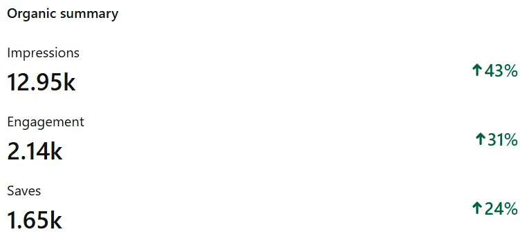
But then, I started improving the hierarchy visuals on the text overlays of my pins, without sacrificing the amount published per day.
Here are the results after a month:
Let's see what I did differently:
1. Size Matters
Your Pinterest pin size is the foundation of your visual success.
The ideal Pinterest pin dimensions are 1000 x 1500 pixels, giving you that perfect 2:3 ratio that Pinterest's algorithm loves.
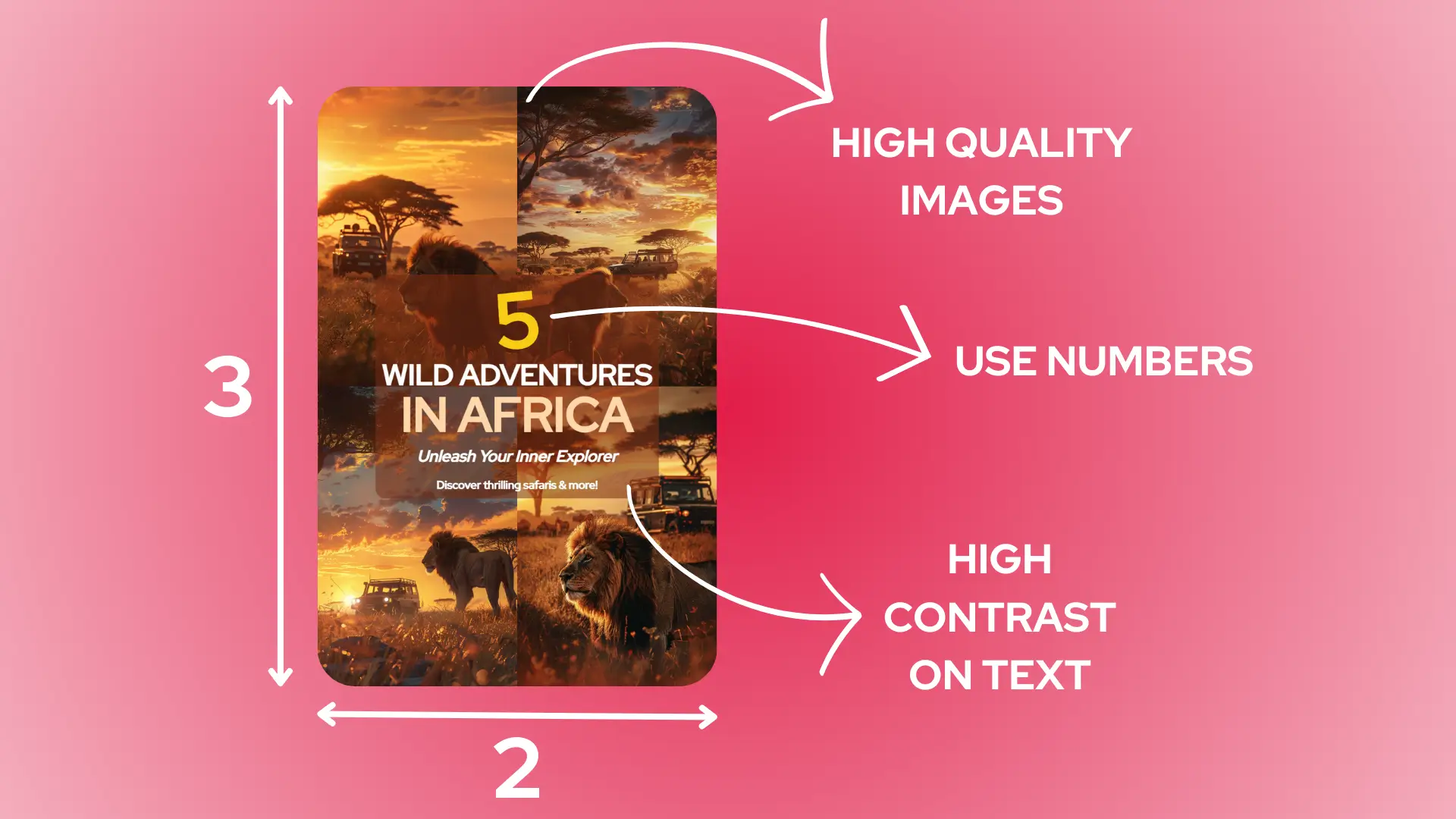
You might be tempted to go wider, but trust me – pins that are too wide get cut off in the mobile feed, where 85% of Pinterest users hang out.
With Swiftpinz, you'll never have to worry about resizing your images manually again, as it automatically optimizes your pin dimensions for maximum visibility.
Longer pins (up to 2100 pixels) can work well for infographics or step-by-step guides, but use this length sparingly to avoid Pinterest's truncation.
The beauty of optimal pin sizing is that it gives you enough space to include compelling visuals and text while maintaining that perfect balance that keeps viewers engaged.
2. High-Contrast Colors
Nothing grabs attention faster on Pinterest than bold, contrasting colors that make your pins pop off the screen.
Think about the last time you noticed a stop sign – it wasn't because of the shape alone, but that striking red against white text that made it impossible to miss.
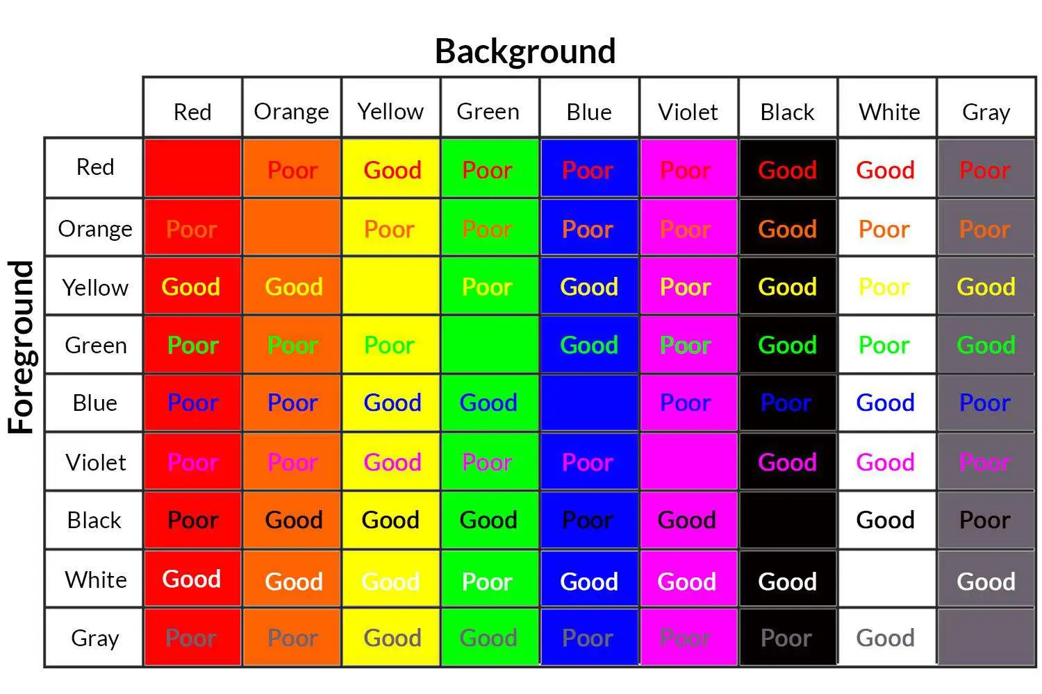
The most successful pins often use one dominant color paired with a contrasting accent that makes text and important elements jump off the screen.
Dark text on light backgrounds (or vice versa) ensures your message remains readable even when users are speed-scrolling through their feeds.
Avoid using colors that are too similar in shade or intensity, as they can blend together and make your pin look muddy on smaller screens.
3. F-Pattern Layout
The F-pattern layout isn't just another design trend – it's based on how our eyes naturally scan content online.
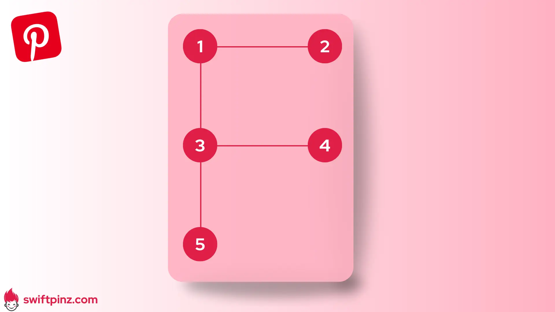
Just like reading a book, your Pinterest audience typically scans pins from left to right and top to bottom, creating an F-shaped pattern.
If you're wondering, yes, Swiftpinz automatically arranges your pin elements in this pattern to maximize viewer engagement and understanding.
Place your most attention-grabbing image or headline at the top of your pin where it naturally catches the eye first.
Your second most important element should be positioned in the middle, creating that crucial horizontal bar of the F-pattern.
The bottom section of your pin is perfect for your call-to-action or website URL, completing the natural eye movement pattern.
This layout works because it respects how humans naturally process visual information, making your pins feel intuitive and easy to understand.
4. Typography Hierarchy
Just like a movie has stars and supporting actors, your pin's text elements need a clear hierarchy to tell your story effectively.
Your main headline should be the star of the show, using the largest font size to immediately grab attention.
The body text or additional details should be smaller yet, but still perfectly readable on mobile devices.
Never use more than three different font sizes in a single pin – like too many cooks in the kitchen, too many font sizes can spoil your design.
The most successful pins maintain a clear size difference between different text elements, typically following a ratio of 2:1:0.5 for headline, subheading, and body text.
5. Depth Through Layering
Picture your pin as a theater stage – the background sets the scene, while foreground elements step forward to capture attention.
One simple way to create depth is by adding a subtle shadow behind your text or key images, making them appear to float above the background.
Using overlays or semi-transparent layers can help your text stand out while maintaining the visibility of your beautiful background image.
The key is to create enough separation between elements without making your pin look cluttered or confusing.
6. Strategic White Space
Think of white space as the perfect host at a party, making sure every guest (design element) has enough room to shine.
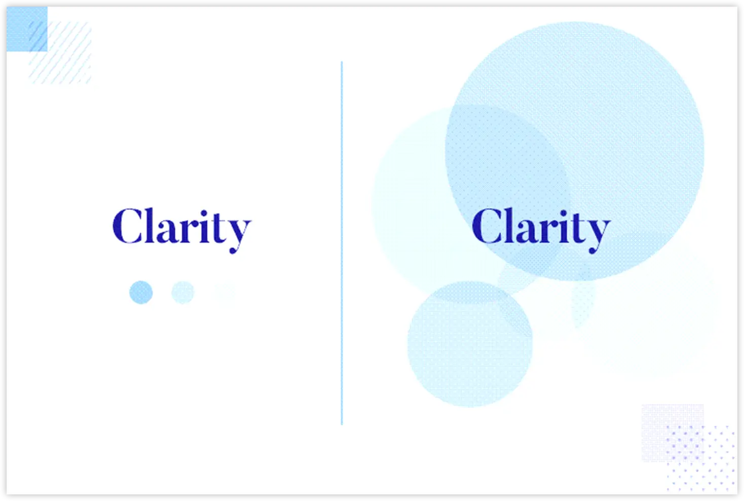
Just like a luxury store displays fewer items to create a high-end feel, strategic white space can make your pins look more professional and sophisticated.
The most effective pins use white space to create natural pauses that guide viewers through the content.
Don't feel pressured to fill every inch of your pin – sometimes less really is more.
7. Eye Movement Direction
Understanding how to direct eye movement through your pin is like being a skilled tour guide for your viewers' attention.
Just as a well-designed museum guides visitors naturally from one exhibit to the next, your pin should lead viewers smoothly from one element to another.
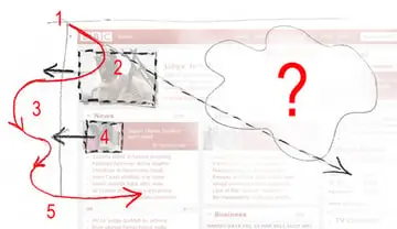
Yes, Swiftpinz helps you create natural eye flow by strategically positioning elements in your pins based on proven design principles.
Think of directional cues like arrows, lines, or even the gaze of people in your images as subtle signposts guiding viewers through your content.
The human eye naturally follows the direction that people, objects, or arrows are pointing in your images.
8. Rule of Thirds
The Rule of Thirds is like the secret recipe that makes your pins visually delicious to Pinterest users.
Imagine your pin divided into a 3x3 grid – the intersections of these lines are your sweet spots for placing important elements.
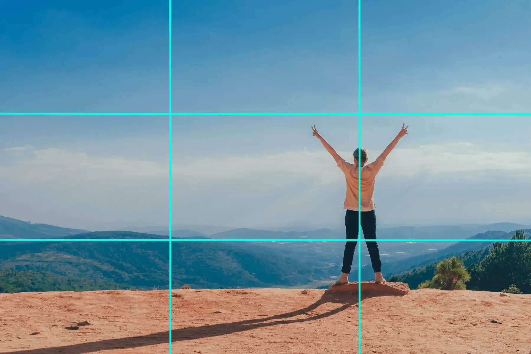
Think of it like setting up the perfect photo – placing your subject slightly off-center often creates more visual interest than centering everything.
By placing important elements along these gridlines or at their intersections, you create a more dynamic and engaging composition.
The human eye naturally gravitates to these intersection points, making them perfect locations for your most important messages or calls-to-action.
This rule works because it creates a natural balance that feels more organic than perfectly centered designs.
9. Brand Consistency
Another of the things that Swiftpinz will help you out is to maintain your brand consistency by letting you save and reuse your brand elements across all your pins.
Your Pinterest pins should be like family members – clearly related but each with their own unique personality.
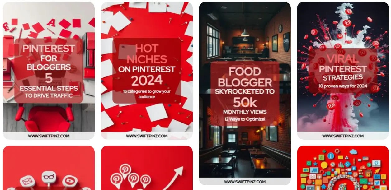
Think of your brand style as your pin's DNA – it should be recognizable even if someone covers up your logo.
Using consistent colors, fonts, and design elements helps viewers instantly recognize your content in their busy Pinterest feeds.
Your brand consistency doesn't mean every pin should look identical – think of it more like variations on a theme.
10. Text Readability
The most successful pins use fonts that are easy to read even when someone's quickly scrolling through their feed.
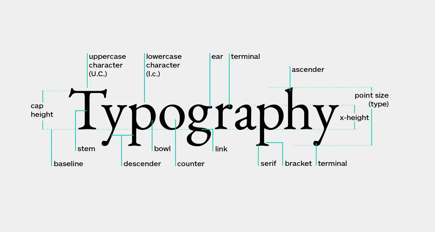
Consider your text size like you would your speaking voice – it needs to be loud enough to be heard clearly, but not shouting.
Avoid fancy or decorative fonts for your main message – they're like trying to have a conversation while wearing a Halloween mask.
If you're using text overlay on images, always ensure there's enough contrast to make the words pop.
11. Pattern Disruption
You can disrupt patterns through unexpected color choices, unique image placements, or creative text arrangements.
The key is to break patterns purposefully, not randomly – like jazz music that knows exactly when to break from the standard rhythm.
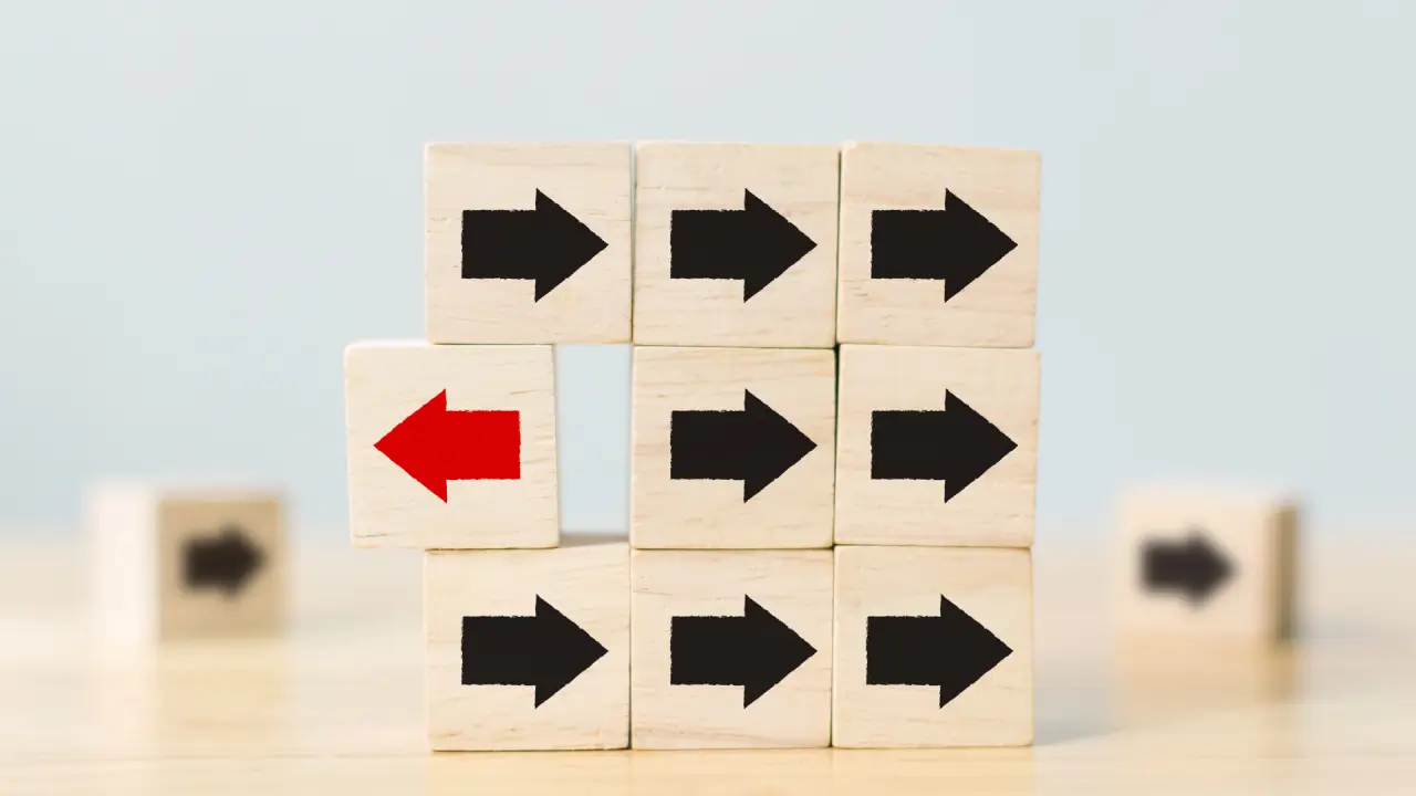
Consider using an unexpected element in your design that makes viewers pause and take a closer look.
12. Visual Weight
Visual weight is about making certain elements of your pin feel heavier or lighter to guide attention effectively.
Darker colors and larger elements naturally carry more visual weight than lighter or smaller ones.
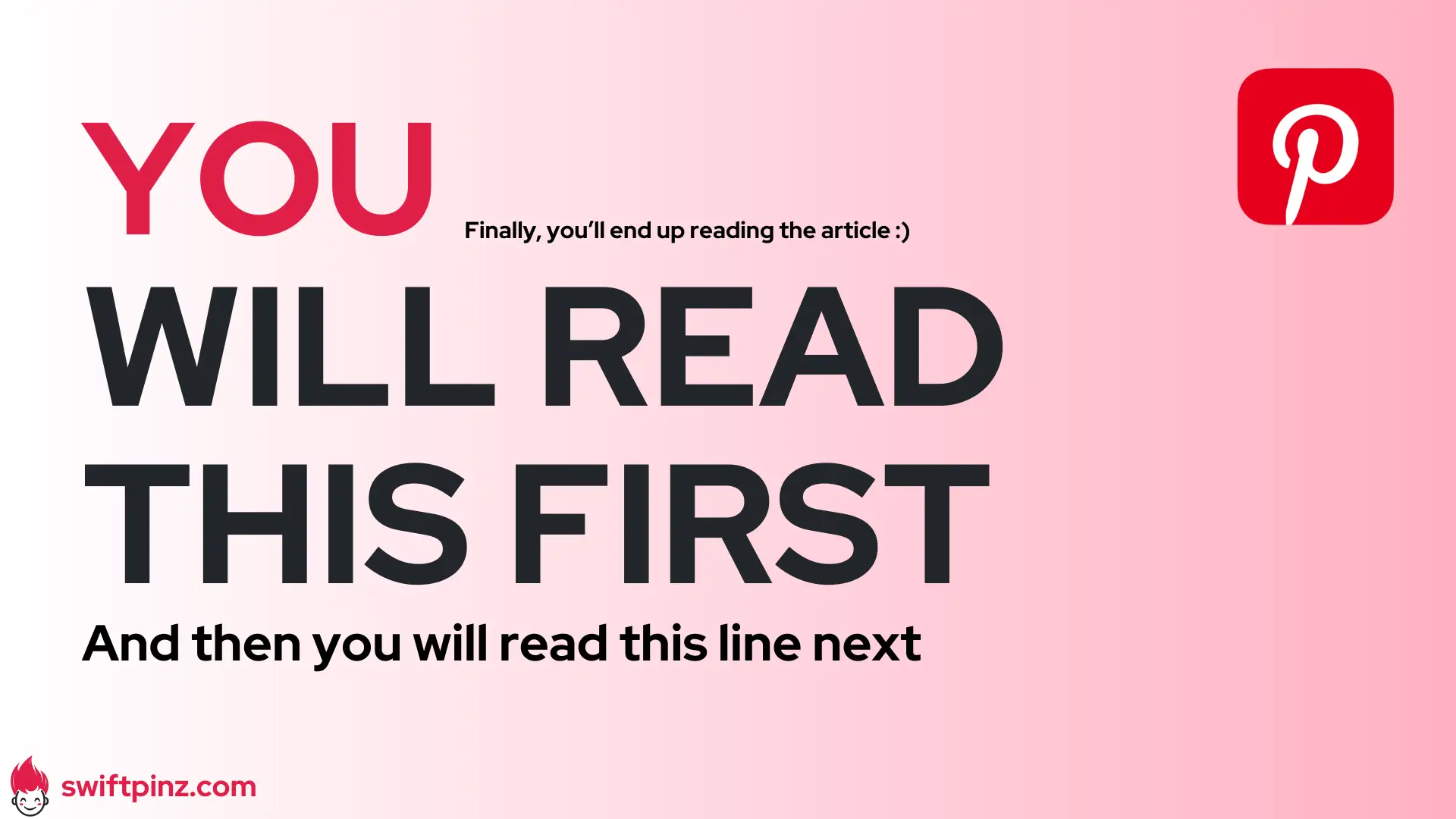
Consider the balance of your pin like a seesaw – if one side feels too heavy, viewers might miss important information on the other side.
You can create visual weight through size, color, contrast, texture, or complexity.
Conclusion
You now have the power to create Pinterest pins that not only look stunning but actually convert.
These design principles aren't just theory - they're your practical toolkit for standing out in the crowded Pinterest feed.
What's next?
- Start small by applying just one or two of these design principles to your next pin.
- Monitor which combinations drive the most traffic to your website.
- Use the data to refine your design and create a cohesive brand identity.
Remember, successful Pinterest marketing is a journey of testing and refinement.
Take action today, and let Swiftpinz handle the heavy lifting while you focus on growing your online presence.
Frequently Asked Questions
What is visual hierarchy in Pinterest design?
Visual hierarchy is simply the way you arrange elements in your pin to guide viewers' eyes to what matters most. Think of it as creating a roadmap for your audience's attention, making sure they notice your most important message first.
How can I make my Pinterest pins stand out in a crowded feed?
Use bold, contrasting colors and make your text large enough to read from a distance. Swiftpinz helps you create eye-catching pins by automatically applying proven design principles that grab attention as users scroll through their feed.
What's the ideal text-to-image ratio for Pinterest pins?
The sweet spot is 30% text and 70% image. You want enough text to convey your message but not so much that it overwhelms the visual element. Swiftpinz automatically helps you maintain this balance in your pins.
Which colors perform best on Pinterest?
Red, pink, and purple tend to get more engagement on Pinterest, but what matters most is using colors that contrast well with each other. Your brand colors can work great too, as long as they're used in a way that makes your text pop against the background.
How do I ensure my pins look good on both mobile and desktop?
Focus on large, clear text and simple designs that work at any size. Swiftpinz automatically optimizes your pins for both mobile and desktop viewing, so you don't have to worry about creating multiple versions.
Should I use templates or create unique designs for each pin?
Start with templates to maintain consistency and save time, then customize them to keep your content fresh. Swiftpinz offers a variety of templates that you can easily modify to create unique-looking pins while keeping your brand recognizable.

