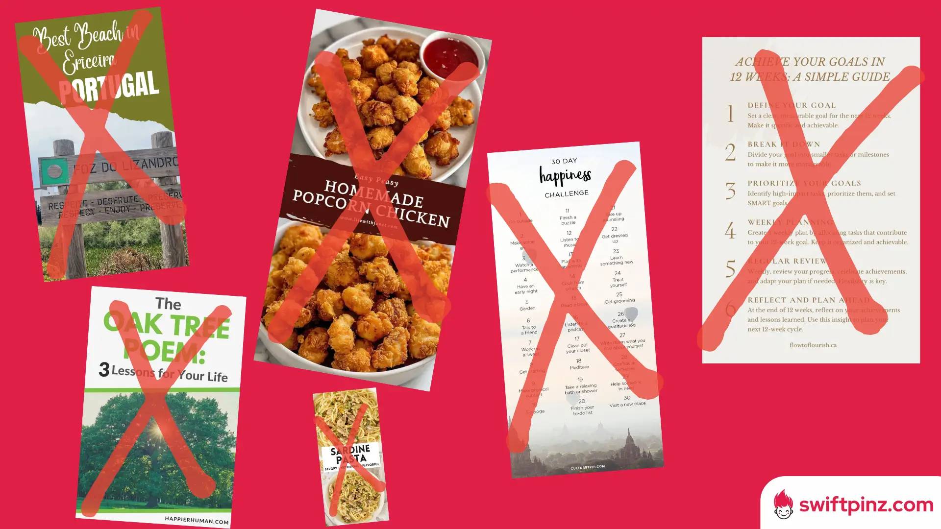
The answer of why your pins aren't getting the attention they deserve probably lies in your pin design...
Trust me, it happened to me 😵💫
As a Pinterest marketing expert with +3 years of experience, I've seen countless users make the same common mistakes over and over.
So, what we're waiting for? Let's discover those mistakes and fix your account right now!
Your Pinterest pins are the digital billboards of your brand. Design them with care, and watch your audience grow beyond compare.
How Bad Design Affects Your Account
You might think that a few design flaws won't hurt your Pinterest game. But let me tell you, bad design can be a real buzzkill for your account's growth.
It's like showing up to a party in mismatched socks – people notice, and not in a good way.
Disadvantages of Bad Designs
Bad pin designs can seriously hinder your Pinterest success. Let's look at some key drawbacks:
- Reduced visibility: Unappealing visuals make users scroll past your content without a second glance.
- Damage to brand reputation: Unprofessional or sloppy pin designs might lead users to assume your products or services are of similar quality.
- Decreased engagement: Poor designs often result in fewer likes, comments, and repins.
- Algorithm disadvantage: Pinterest's algorithm favors high-quality, engaging content. Bad designs may cause your pins to get lost in the vast sea of content.
- Wasted resources: If your designs don't attract clicks, the time and effort you put into creating content goes to waste.
- Lower conversion rates: Even if users do click, bad designs may fail to convey your message effectively, leading to fewer conversions.
15 Pin Design Mistakes to Avoid
Let's dive into the common Pinterest pin design mistakes that could be holding you back from achieving viral status.
For a better understanding of these mistakes, let's look at some examples of what you should avoid to do.
1. Unclear or tiny text
Have you ever squinted at a pin, trying to decipher its message? Don't put your audience through that!
Use clear, legible fonts and make sure your text is large enough to read easily on mobile devices. Remember, many users browse Pinterest on their phones.
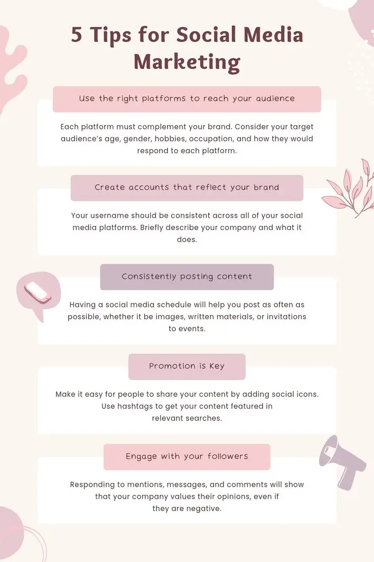
2. Poor color contrast
Imagine trying to read white text on a pale yellow background. Frustrating, right?
Good contrast between your text and background is crucial for readability. Opt for color combinations that pop and make your message stand out.
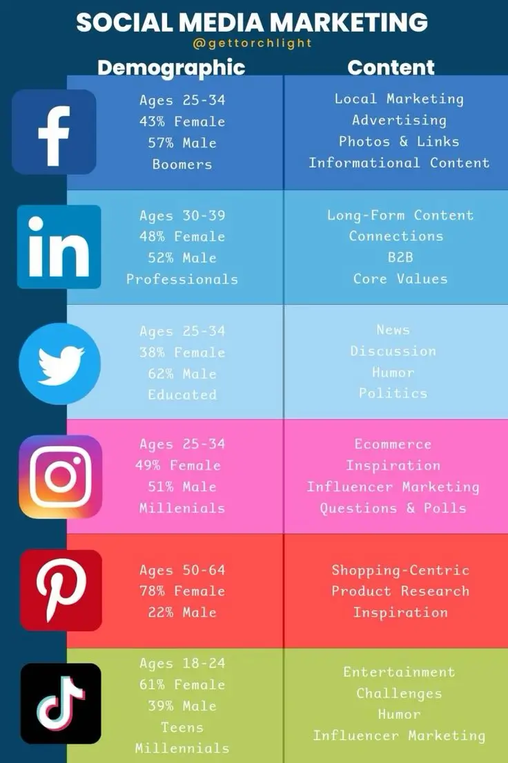
3. Overcrowding the image
You know that feeling when you walk into a cluttered room? That's how users feel when they see an overcrowded pin.
Keep your design clean and focused. Don't try to cram every detail into one image. Sometimes, less really is more.
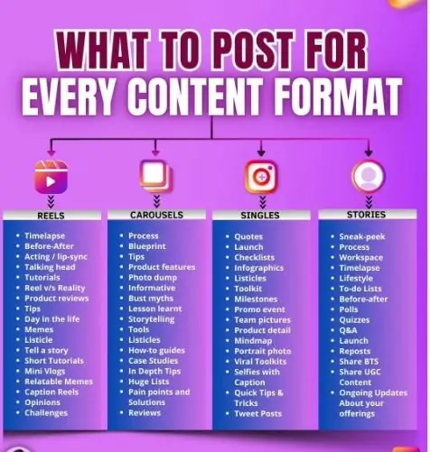
4. Using low-quality images
Blurry or pixelated images are a big no-no on Pinterest. They make your pins look unprofessional and can turn potential followers away.
Always use high-resolution images that look crisp and clear, even when zoomed in.
5. Inconsistent branding
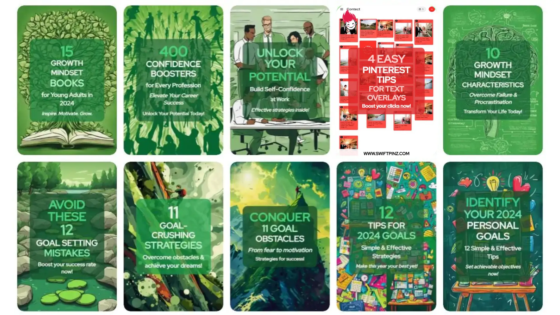
Your pins should be like a family - related and recognizable. Inconsistent branding across your pins can confuse your audience and dilute your brand identity.
Stick to a consistent color scheme, font style, and overall aesthetic that aligns with your brand.
6. Neglecting vertical orientation
Ever tried to fit a square peg in a round hole? That's what horizontal images feel like on Pinterest.
The platform favors vertical pins, typically with a 2:3 aspect ratio. Vertical pins take up more space in users' feeds, increasing visibility and engagement.
7. Missing call-to-action
You've caught their eye, but now what? Without a clear call-to-action (CTA), users might admire your pin and move on.
Include a simple, compelling CTA like "Click for recipe" or "Learn more" to guide users on what to do next.
8. Irrelevant or misleading visuals
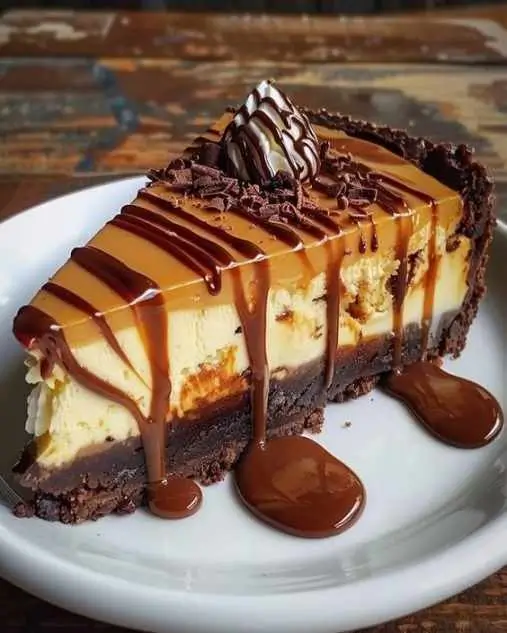
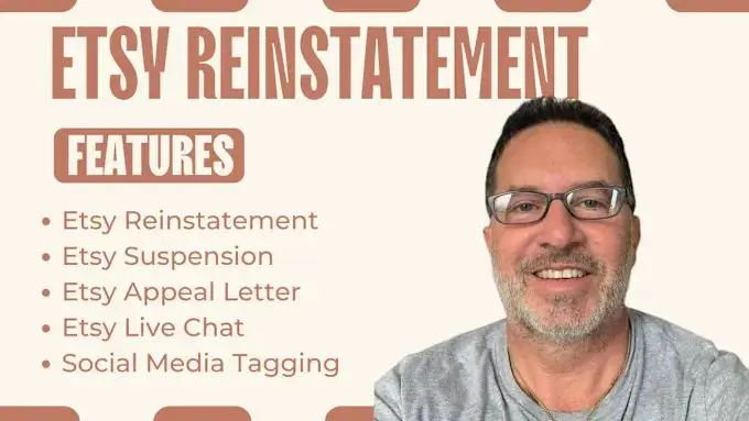
Picture this: a mouthwatering chocolate cake pin that leads to an article about lawn care. Disappointing, right? Always ensure your visuals accurately represent your content.
Misleading images might get clicks initially, but they'll harm your credibility in the long run.
9. Overusing stock photos
While stock photos can be useful, relying on them too heavily can make your pins blend into the Pinterest background. Try to incorporate unique, original images or graphics when possible.
Your audience will appreciate the authenticity and your pins will stand out more.

10. Ignoring SEO in titles and descriptions
Your stunning visuals might catch the eye, but don't forget about the text! Neglecting SEO in your pin titles and descriptions is like hiding your content from the Pinterest search engine.
Include relevant keywords to help users find your pins when they're searching for related topics.
11. Lack of white space
Ever felt overwhelmed looking at a cluttered bulletin board? That's how users feel when pins lack white space. Don't be afraid of empty areas in your design.
White space helps important elements stand out and makes your pin easier on the eyes. It gives your content room to breathe.
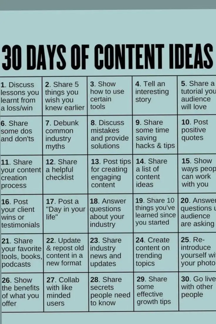
12. Too many fonts or mismatched typography
Using a different font for every word isn't creative, it's chaotic. Stick to one or two complementary fonts in your pin designs.
Choose fonts that reflect your brand personality and are easy to read. Remember, consistency is key in building brand recognition.
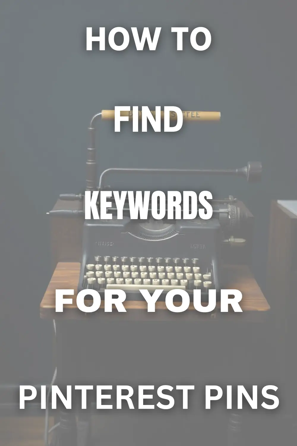
13. Not optimizing for mobile viewing
Did you know that over 85% of Pinterest users access the platform via mobile? If your pins aren't mobile-friendly, you're missing out big time.
Ensure text is readable and images are clear on smaller screens. Test your pins on various devices before publishing.
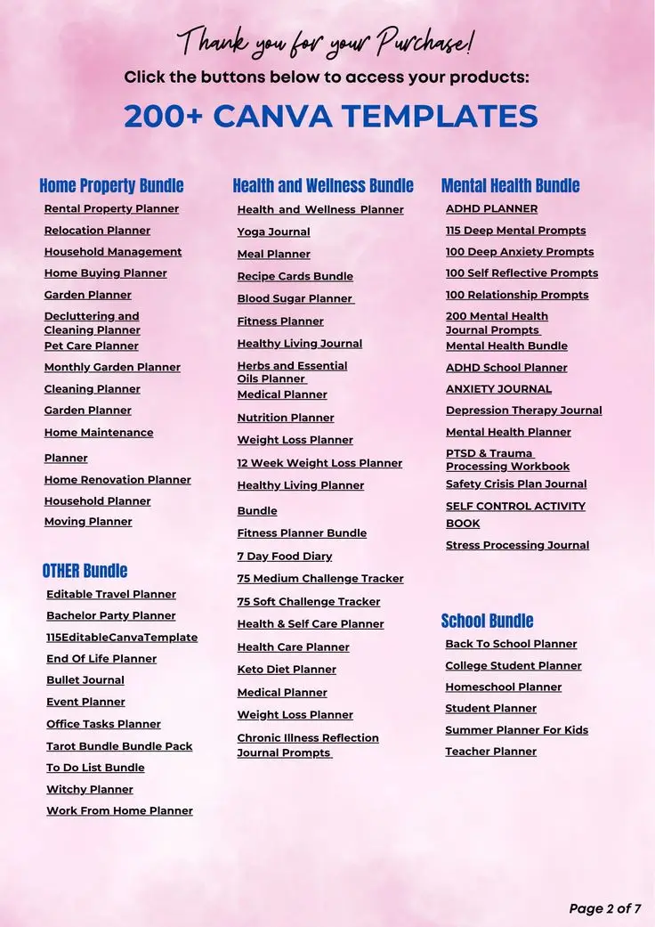
14. Failing to include your logo or website
Imagine your pin goes viral, but no one knows it's yours. Heartbreaking, right? Always include your logo or website URL in a subtle yet visible spot on your pins.
It's your signature, helping users recognize and remember your brand amidst the sea of content.
15. Using copyrighted images without permission
Last but not least, avoid the temptation of using copyrighted images without proper authorization. It's not just about ethics – it can lead to legal troubles and damage your reputation.
Stick to your own images, properly licensed stock photos, or free-to-use resources.
Conclusion
Congratulations! You're now armed with the knowledge to avoid 15 common Pinterest pin design mistakes. By steering clear of these pitfalls, you're setting yourself up for Pinterest success.
Great pin design isn't just about looking pretty – it's about creating content that catches the eye, conveys your message clearly, and drives engagement.
Don't be discouraged if your first attempts aren't perfect. Pinterest marketing is a skill that improves with practice.
Keep experimenting, learning from your analytics, and refining your approach. Your pins will get better and better over time.
What's next
Now that you know what to avoid, it's time to put your new knowledge into action. Start by reviewing your existing pins and see where you can make improvements.
Then, create some new pins applying these principles. Watch your engagement grow as you implement these design best practices!
Frequently Asked Questions
What is the ideal size for a Pinterest pin?
The ideal size for a Pinterest pin is 1000 x 1500 pixels, with a 2:3 aspect ratio. This vertical format performs best on the platform, taking up more space in users' feeds and increasing visibility.
How can I make my Pinterest pins more clickable?
To make your pins more clickable, use eye-catching visuals, clear and concise text, and a strong call-to-action. Ensure your content is relevant to your target audience and use keywords in your titles and descriptions for better searchability.
Should I use text on my Pinterest pins?
Yes, using text on your Pinterest pins is recommended. Text helps explain your content quickly and can entice users to click. Keep it brief, easy to read, and make sure it complements your visual elements without overwhelming them.
How often should I update my Pinterest pin designs?
Update your Pinterest pin designs regularly, ideally every few months. This keeps your content fresh and allows you to adapt to current trends. However, maintain consistent branding elements to ensure your pins remain recognizable to your audience.
How many pins should I create for each blog post or product?
Create 3-5 pins for each blog post or product. This allows you to test different designs and appeal to various audience preferences. Space out the pinning of these variations over time to maximize your content's reach.
Are there any tools that can help me design better Pinterest pins?
Yes, several tools can help you design better Pinterest pins. Canva, PicMonkey, and Adobe Spark are popular options. These user-friendly platforms offer templates, stock images, and design elements specifically for creating Pinterest-friendly graphics.

